Tuesday 13 March 2012

Storytellers and Propagandists

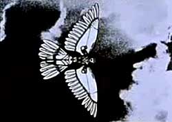
 This is a still from Jan Lenica's animation, 'Labyrinth' and a link to watch the video. I find his work completely captivating. The way he uses collage, drawing and moving image to build up utterly surreal worlds and characters is so skilful that this work transcends the label of a cartoon and exists as a piece of fascinating, beautiful and complete artwork in its own right. Animation is such an exciting tool for elevating a drawing and exploring its potential meanings and emotional impact. The soundtrack in this piece adds to and enforces the atmosphere of unease and heightens the feeling of tension, which is particularly apparent when you understand the context in which the film was made. This Kafka-esque, politically charged animation was made in the wake of De-Stalinisation in Poland, with artists finding a new freedom of expression which had been denied to them by Communist censorship, and with an influx of state-sponsored art under the new government, people could now discuss experiences of hardship and oppression. And I suppose through collage and drawing as opposed to a live action film, the artist is free to be imaginative and expressive with use of metaphor, without the constraints of contemporary technologies. I think that films like this have far more charm, aesthetic value and feeling of authorship than modern cartoons made using CGI.
 http://www.youtube.com/watch?v=Zdq38KPMCvY

Monday 12 March 2012

Storytellers and propagandists


I tend to consider illustration as one of the essential purposes of drawing. Whether it is for children’s books or propaganda posters. Illustrations work on their own. The images might be re-enforced or clarified through text, but the drawings tend to be the centre of focus.

I have a strong passion for “storytellers without language” -illustrators who use little or no text, or whose work does its purpose before you have even started reading the text.

Both children’s book illustration and propaganda art have certain things in common. Such as a lack of realism with exaggerations and modifications from how we see things in real life. Illustration is not necessarily fine art created from references and life studies, it is often drawn from memory, to create ideas and associations rather than to illustrate an exact truth. Essentially, in the way Nigel Homes describes diagram making in Information Without Language.


Shaun Tan’s painting “They came by water” from his book The Rabbits is a prime example of how picture books and propaganda can have very much in common. The book is an allegorical fable on colonisation, though it is considered a children’s book, it might be more appropriate for adults. The absurd shapes, colours and the atmosphere makes a distinct allusion to propaganda posters portraying “the enemy”.

Thursday 8 March 2012

Storytellers and propagandists

Kallithea Camp Athens (18 November 1959).   

 The distinctive ‘shaky’ line of this drawing is instantly recognisable as that of the late illustrator and artist reporter Ronald Searle.  During his career Searle had the opportunity to travel all over the world, using drawing to report on global issues, often from an alternative perspective.  His intention was to get behind the exaggerations of tabloid newspapers and expose the reality of the situation.  Searle’s observation is exquisite and I find his sketches truly beguiling in their impeccable depiction of human existence.  Searle often employed humour in his work, but was entirely capable of changing his drawing style to suit the seriousness of the subject.  With a knack for capturing things precisely as they were, Searle’s sketches could successfully influence the viewer’s view of a situation, alerting them to something they may not have been previously aware off.  This particular image was sketched in 1959, as part of a series of illustrations highlighting the plight of the world’s refugees.  Perhaps what he had to endure as a PoW during World War II allowed Ronald Searle a deeper insight into the sufferings experienced by these people: 

“I tried, in that case, to explain the person in front of me without any sort of trickery or exaggeration.  Tried to get behind the sadness or the hopelessness of most of these camps – everyone abandoned.”[1] 

I would say that Searle has definitely achieved what he set out to convey – the desperation and misery of the situation is palpable in this hopeless image.  The row of ramshackle lean-tos extends precariously into the distance, perhaps for miles, emphasising the magnitude of the hardships faced by the refugees. The eye is drawn to the lonely figure hunched over decrepitly in the foreground.  One is hit by the severity and inhumanity of it all, and this is where Ronald Searle’s talent as a ‘storyteller’ lies – his illustrations present to us true stories with a candour and perceptivity that surely cannot fail to persuade the viewer to come to some sort of conclusion.  No doubt likely to be one of agreement with the opinions expressed by the artist himself.


[1] Robert Searle, taken from Derek Brazell and Jo Daries, Making Great Illustration, p81

Wednesday 29 February 2012

manifesto: persuasion and argumentation in drawing


here is one of the most straightforwardly persuasive draughtsmen I know, Daumier's anti-war blast 'The council of war' 1872. In fact, sorry to stay on the war theme, here is another equally forceful statement in a very different mode, the graphic description of Napoleon's losses during the Russian campaign of 1812, plotted against terrain, time, and temprature. The big fat arrow going right is the army marching east to Moscow, the dwindling arrow pointing left is the ghastly defeated and starving army trying to get back home in the winter. This is one of the first uses of graphic display, and showcased in Edward Tufte's book on Visual Communications. Evidently,Minard is one of Tufte's heroes, with reason. Look at Tufte's book if you want a glimpse at the poetry of railway timetabling!

Tuesday 21 February 2012

Other artists work: What is his manifesto/manifested in the drawing? - C.B. Stapleton

C.Y. Twombly-
It’s difficult to make a calibrated and semi-nuanced case in favor of a prominent artist who’s just died. Opinions at tend to fall emphatically either in the direction of praise (Twombly was one of the greatest American artists of the post-World-War-II era) or bah-humbug (Twombly was a late-to-the-game Abstract Expressionist who tarted up comparatively vacuous paintings with references advertising his erudition). For me, the two extremes are both true, but in a way that leaves my estimation of Twombly not in the middle, but way over on the positive side. Though his works seem to resemble doodling, involuntary drawing or a child
practising writing, he introduces painting in the style of ancient graffiti,
scribbled texts, drawings and simple hand exercises.

Cy Twombly stretched Abstract Expressionism to its limit. He filled his work with a whole lot of white, punctuated by what most critics affectionately call “scribbles,” words printed or written as if by a palsied hand, and clots of nervous brushstrokes that looked like chrysthanemums.
Fifty Days at Iliam: Shield of Achilles, 1978 by Cy Twombly

There’s still something faintly galling about Twombly’s words on canvas, and I probably don’t believe that he misspelled “Ilium” as “Iliam” in the Fifty Days at Iliam permanent gallery at the Philadelphia Museum of Art on purpose because he wanted an “a” to refer to Achilles. Do we really need the words? Do they really add anything, visually, to the work? Do they really evoke anything about their putative subject, beyond simple labeling?
Many people scratch their heads at abstract art and doubt the skills of abstract artists in general, not to mention when the art looks like scribbles. According to The New York Times’ ArtsBeats blog, “…even critics questioned constantly whether Twombly’s work deserved a place at the forefront of 20th-century abstraction, though he lived long enough to see it arrive there.”

Monday 20 February 2012

Sorry for the poor quality! I did this drawing within the past 6 months. This time has been a big learning curve for me within the realms of drawn work. I have always drawn, but never thought I could use it to make strong final pieces, it's always a by product of the creative processes I go through. Over the summer and the past terms I've been working more on my drawing skills, trying to practise frequently, and learning to enjoy it. I did this particular drawing in a life class last term. Firstly I loved the model, I thought she had great character and I'd never drawn a female figure from life before. I am also a big fan of blind drawing techniques and often some of my personal bests/favourites are created this way. I think the quality of line you achieve from loosening up is fantastic and adds a certain charm I can't always get from a focussed sketch. This image is also successful to me as it marks a big turning point in the way I thought about my own image making - starting to believe that I could use drawing in a freer sense, not worrying about how polished or perfected it looks.

Aurore De La Morinerie is fanshion illustrator who captures mood, movement, texture, detail and form. Morinerie achieves all this in a very minimalistic style with quick marking making which can appear to be ink stains at the first glance and often using one colour, watercolour, on coloured paper and letting the negative space make up as much of the image as the marks he lays down.


As I stated in my first blog post it is the marks and the lack of marks that pull me into a drawing. I feel Morinerie's work encapsulates almost everything that I look for and try to create myself in drawings(at this time anyway).

Wednesday 8 February 2012

What is drawing for?/What is my most successful drawing at the moment and why? - C.B. Stapleton

This question initially prompted me to investigate the most easily assumed answer; the definition of drawing itself. The current shorted Oxford dictionary defines drawing as 'the formation of a line by drawing some tracing instrument from point to point of a surface; representation by lines, delineation as distinguished from painting, the arrangement of lines which determine form.' Yet I began to question whether drawing can actually be defined.
Drawing is probably a lot of things to a lot of different people, in a sense it is used to communicate. A mode of thinking, an extension. Drawing is much more than simply a visual issue, it is an investigation. Knowing what is drawing for is much harder to define.
There are many different reasons why people draw;
  • to visualise thought and work something out.
  • to provide a pattern to follow or give instructions how to make something.
  • to help clients visualise what is proposed.
  • to describe or record something.
  • to give pleasure as ends in themselves.

As I recognised the reasons why and what we used drawing for, I considered my own uses for drawing and why I use it in my work.

All jewellery design originates from an inspirational source, whether its a technique or material or visual information from drawing images or objects. By gathering information from a wide range of sources it can spark interest to investigate further. As jewellery is a three-dimensional medium, it is beneficial to study 3-D forms as to aid understanding how form can be expressed and how shapes and lines intersect with one another in relation to each other and within space.

By keeping a sketchbook as a sort of visual diary to record the things you find and particular aspects to be found interesting when working with a project in mind the research takes on a particular direction which may lead to several paths; some may be dead ends, but others can provide inspiration for years to come. Drawing is a vital design tool as it provides a means of exploring and recording ideas in a descriptive medium. A silversmith/jewellery designer may use several types of drawing as part of the design process from sketchbooks to exploratory drawing to detailed technical drawing and final presentation drawing. The method of illustration that is chosen will depend on the particular project and client, but clear communication is the key whatever the style .

My most successful drawing to date within the Silversmithing and Jewellery department at GSA is in the form of Maya, a 3 Dimensional animation software(See above centre). It was used with the help of my friend Saswat Satadaryshi, who is a current student of MDES in Animation at GSA. As my final design was proposed on a larger scale with specific lighting involved. This form of precise animation included all the relevant information, including the scale of the piece. Presentation drawings such as this are most useful when working to commission so that the client can see accurate representations of the piece before it is made. Successful design realization can give a silversmith/jeweller a powerful voice and means of expression. The transition from a two-dimensional drawings to three-dimensional objects can be a challenge, so making models of a piece is a key part of the process, in both technical and aesthetic aspects of designing.

Tuesday 7 February 2012

Richard Tuttle


Richard Tuttle (b. 1941, Rahway, New Jersey; lives and works in New York and New Mexico) 
44th Wire Piece, 1972
Wire and template for pencil line
47 x 22 x 11 1/4 in.
The Museum of Contemporary Art, Los Angeles
Gift of Lannan Foundation


Despite the fact that the ideas of artist Richard Tuttle predominantly manifest themselves in 3D form, he would not class his work as ‘sculpture’, but as drawing.  For this reason, his work challenges the traditional ideas of drawing.  Tuttle himself says, “I put this enormous pressure on what drawing is, but I know it’s not the conventional way of thinking about drawing. Everything in life is drawing; drawing is such an enormous thing in itself.”[1]

His interest lies in exploring the relationship between sculpture and drawing and in doing so he raises questions about what drawing is.  He uses charcoal, ink, graphite and watercolour, juxtaposing these with more everyday materials such as paper, wire, cloth, nails, styrofoam and plywood.  Tuttle’s investigations into this relationship include his wire pieces from the 1970s. The minimal and delicate nature of these pieces really appeals to me, as does the transition from ink to wire to shadow; 2D to 3D, then back to 2D again.  I enjoy the subtly and fluidity of the marks.  Tuttle’s interest in the calligraphic line is evident in this work. 

As well as being concerned with the careful observation of detail and of visible things, I was also intrigued by Richard Tuttle’s fascination with the less tangible, with things unseen: 

“I was doing white paper octagons on a wall at a museum in Dallas. And the critic came along and made mock introductions, “Oh, this is Richard Tuttle. He’s interested in impermanence in the arts.” And she said that to Betty Parsons, and Betty just immediately snapped back, “What’s more permanent than the invisible?”[2]


[1] Interview with Richard Tuttle, Art21 website, URL: http://www.art21.org/texts/richard-tuttle/interview-richard-tuttle-drawing-and-exhibitions, (06/02/12)
[2] Ibid.

7 February 2012 manifest/ manifesto


other artists’ work: what is the manifesto in this drawing, what does the artist or designer aim to manifest in their work? Find and post at least one successful or controversial image and 100-300 words of reflection, analysis and context,
best wishes, Frances I chose this image by August Choisy from 1873, it is an axonometric rendering of a Roman vault from below. On the one hand it aims for strong information content and transparency, one could 'read off' the structure of this vault and reconstruct it from this drawing, because in this convention, every dimension is easy to calculate. Second, it presents a fairly strong triumphant announcement of skill by the artist, he shows he can observe and work out a complex structure and recreate it in detail even from a ruin, and he also announces his ability to re-present that complex information visually. Third, and in contrast to the notion of transparency, this image is very puzzling and atmospheric, it is a view that would not be available from any normal viewpoint, and it presents the building behaving abnormaly, rising up into space, hovering threateningly over the viewer like a thundercloud. I like the kick-ass quality of the drawing, the assertion of skill, and the threat. To me , this draughstman is saying, one little word and I could crush U with this old vault

Wednesday 1 February 2012

A Successful Drawing


This drawing is a close up of a piece of work produced during a day out at the Burrell Collection at the end of last term.  The brief required us to spend some time drawing a small section of an object onto an A6 piece of paper.  We were then asked to stick this onto a larger sheet and work out from there, filling in the surrounding detail.  As I wandered around the building, I found this ‘Jack’ clock tucked away in a corner.  My eye was instantly drawn to the intricate inner mechanical workings, so I sat down and got started, quite pleased with my discovery. However, I very quickly came to regret my choice as I spent most of the rest of the day wrestling with my drawing.  I wanted to depict the cogs and wheels as accurately as I could, but was getting increasing frustrated with my efforts.  I think that I felt restricted by the small size of paper I was trying to work on. 

Towards the end of the day we gathered together for a quick review of how things were going so far.  I was all ready to give up at this point, and was feeling pretty discouraged.  One of the girls on my course suggested that I treat the remainder of the drawing as a blind drawing, as she remembered that I had really enjoyed this method during Life Drawing class.  I’m not really sure why I had not considered doing this myself before then, but it seemed like such an obvious solution as soon as she said it.

I was amazed at the difference in my drawing, as well as my mood once I got back to work.  Drawing blindly really helped to free me up.  It allowed me to let go of control.  I was no longer afraid to ruin the smaller drawing I had spend all day doing.  The juxtaposition of the more controlled, precise drawing with the looser, flowing lines really appeals to me.  So I guess for me this drawing is a valuable lesson in persistence, the value of others’ advice, and the surprising results you can get if you are willing to relinquish control.

Tuesday 31 January 2012

dad

we were meant to put up a recent picture, and i suppose you could argue i did this 4 years ago, so its not that recent. But, i have a crazy amount of drawings from the day i was born. I my mum is a painter and she made me draw from day one, and shes kept ALOT of evidence. haha. I will post i really recent drawing too, and compare it to this one. This is a drawing of my dads head. I remember doing so clearly in his smokey, dark red living room while he was watching a 1980s film with jean wilder, one of his favourite actors. My dad had an accident, and was spending a a lot of time on is old battered red velvet couch, so i crew him as a couch potato - hence its just his head. This was a time when i was trying to understand my dad better, and not argue with him as much - we managed to get on well when he would talk about his work, or he showed me his carvings. The hundreds of multiple lines are a imitation of how my dad carves into purbec hard white stone, and since i was little had a very strong love of watching my dad whittle away at stone, leaving the raw groves from a specific pronged chisel he ha shaped himself. I really had to look hard into every wrinkle hair and scar - to satisfy this angry want to understand or be on a level with my dad. He is so physically connected to his work, and he is pretty miserable when hes not carving. So, yep, I'm carving his face on the pace in the style he works in, pretty simple. I also I'm pretty miserable when I'm not making, an this for me  is one of the most important drawings Ive ever done for that reason - its up in my room, a place i see it everyday to encourage me to work to keep sane and happy, even if its a little doodle of my neighbours cat.

Monday 30 January 2012

Architecture "Narrative Sketch"

This Drawing was created during the first half of my second studio project which was located in govan. Afterour site visit we were asked to write a short narrative which discribes a journey to or from Govan.

My narative was about an elderly man who revisited govan with his grandson. On arival he was shocked with how much govan has changed from his childhood. The fast moving flow of workers to and from the ship yards has vanished and all wich was left is memory trapped in his mind.

From that narrative we were asked to create a collage which explores our narrative. The drawing i uploaded is a quick ink pen drawing on tracing paper. I though this was successfull as the traceing paper allowed me to work rather fast overlaying the different levels of the narrative.
The narrator Angus isremeniscing about the days when shipbuilding dominated Govan.

We are getting pulled into his memory, layer by layer,  while his memory beginsto evolve around us. Before we know it we start to bepart of the large crowd which disperses into the ever ending memory.
and as we look closer at this memory we realise that we are now indeed looking back at angus (faded in the background, with all the layers of memories bewteen us(the memory) and angus...who now is reality)

Although this was only a quick sketch before actually creating the collage , I was able to explore diferent concepts such as movement layering and looking back.
Duing the whole project i kept looking back at this skecth in order not to distance myself too far from my initial concepts.


Successful drawing


This is a drawing/collage that I did for The Outsider by Albert Camus. I created the man out of collaged pieces of the inside of envelopes,  I find these to be particularly interesting as they come in so many shades and designs. I thought the choice of using the insides of envelopes was appropriate for depicting Meursault, the main character who often demonstrates emotional detachment from his environment. 
I created the shadow out of a combination of thread and pencil line drawings. I think this works well as it  creates an uneven effect and doesn't make the drawing as a whole look too neat.  Once I'd finished the drawing I flattened the image by scanning it, I think this creates a more finished look and helps to pull out the shadows that the thread is creating which adds more depth.

drawing as research?


This drawing is a series of sketches I made for my last Architecture project, which was located on the south bank of the Clyde in Govan.  My brief was to design a sea- plane terminal.  Throughout the design process, I explored the idea of 'journey' and was keen to consider not only the immediate context of the building, but also the approach to the site.  

These quick pencil sketches are quite rough and were done as part of an investigation into the journey to the site.  Rather than one or two more detailed drawings, I decided to do a series of sketches as I thought it would be an efficient way to depict the approach over a period of time.  I was able to quickly record how the surrounding buildings along the journey move in and out of sight, and at which points along the route my proposed terminal would be visible.  I chose to shade darker areas and overemphasise the contrast be leaving out mid tones in order to study the effect of light and shadow.  

I found these drawings were more helpful to look at when considering the journey throughout the development of my scheme, than say detailed measurements or more technical sketches/drawings.  I would say that as a piece of research the drawing was effective as it allowed me to filter out the unnecessary information that would be present if I had photographed the same route, and focus only on the aspects of the approach that were relevant to my research.   


In Architecture, drawing is used to convey an idea. During the design stage, sketches and diagrams are essential, as each structure starts from a doodle. With time each line gains meaning. The line transforms to a dimension, then a form, texture and material. The objective of each architect is to present a drawing or series of drawings that is legible without requiring any further oral or written explanation. Therefore, the most difficult task is to choose the right images- sections, plans, perspectives and combine them with the appropriate technique, all against time. 

Personally, the hardest moment is just before the first line is drawn in a new sketchbook. I usually begin with writing notes or accumulate ideas about a project in my head, leaving sketching to a later stage. This is probably due to the lack of belief in my drawing skills. I sometimes feel that a sketch begins to warp the initial idea, mostly taking it in the opposite direction. For me, model making is the better solution, probably because I tend to think of objects and spaces three-dimensionally, as forms rather than lines.

This drawing/collage was produced for a project called Transitional Space. It required me to design a seaplane terminal in Govan. The design process was particularly interesting, I was asked to write a narrative about a journey which then could be transformed into a collage portraying a series of moments in time. My narrative spoke about the violent disconnection of the Govan community, previously the shipbuilding centre of Glasgow, from the Clyde- a child's struggle to sail his toy boat on the river.  The design concept was to be developed from a zoomed-in element of the collage. An incidental line was to become an object.  


Sunday 29 January 2012

A successful drawing...


Drawing is for communicating and telling stories. It is also for expressing personalities and ideas. In these drawings I am recording an object using different marks. The object is a little metal sculpture of a horse. I was given it as a present when I was two and it is pretty special. It has a tail made from a bicycle chain and legs made from nails. I wanted to convey its strange, wonky appearance and I didn’t think this would come from using a pencil or a pen so I used different materials I could find around me. I used sponges, twigs, keys for the legs, the ring of a cup, cable ties for the ears and my finger for the nose. I found this resourceful way of illustrating much more exciting than just using the contents of my pencil case. Here each line, curve, block of colour is varied in weight, shape and tone. I find that the drawing is successful because it does have the same character as the object and this is something that could not be communicated through a photograph.

Thursday 26 January 2012

Successful drawing


This is a felt tip pen drawing from a lino cut print I did for one of my recent projects which I really like. The project was about chain reactions and I was looking at the reaction of repeatedly using a stamp and I became very interested in the marks this created. I really enjoy doing drawings from drawings, taking them apart or focusing on one bit in particular or using another media. By doing this I find I can see things in a different way and it can often help my design process. It helps me to pick out certain elements I really like and can often lead onto create something more interesting than the original drawing.


As with these pages from my sketchbook repeating the print in a different media helped me to think more about how I could perhaps translate the shapes created by it into metal (I study Silversmithing and Jewellery), whether it be wire or sheet. Although I find it very useful to do repeat drawings, occasionaly I think I can get stuck looking at one thing too much and I think sometimes I should move on and explore other things.

Tuesday 24 January 2012

X-ray of ribs

 This drawing is a charcoal study of an x-ray of the ribs. With quick forceful marks making up the bulk of the drawing I think it gives a clear representation of ribs/lungs as well as the holographic quality from the x-ray. I like that the drawing has a rough appearance but at the same time the viewer(I hope) can easily make out what it is and captures a 3D quality to it. Although this drawing may not be my best, it's important to me as it was where I began to notice that I'm more interested in the marks that make up the drawing rather than the overall finished structure or subject. It was also the start of me making quick rough marks on the page and then drawing in the more precise lines to hold/pull the drawing together, rather than doing the linear work first and then adding detailed texture.

 I am interested in how very rushed marks and a few considered lines can build up a clear image. For instance in the top right hand corner of the drawing I left clean lines to show the collar bone and beginnings of the shoulder as well as including more definite bold black lines to show the ribs, without these context might have been lost.

 I believe there is a connection between my drawings and my jewellery, as I'm also interested in the textural quality of the metals and rarely create "busy" looking pieces.


24/1/12


I do not draw a lot. Yet I doodle constantly,  I find it to be a good way to keep myself concentrating in lectures and a good way to brainstorm during projects.  I consider the drawing and doodling completely different actions.  While my “drawings” are tight and rigid things that I cannot find it in me to appreciate, my doodles are looser and can be more interesting; or so I find.  I challenged myself last term with help from my tutor and Betty Edwards’ “Drawing on the Right Side of the Brain” to  integrate the two things into one activity that I might enjoy, I’m still very much working on it.  I barely use drawing in my own personal practice, and although this is not an issue most of the time, it does make me feel restricted when working with certain projects. (Which is why I chose Marking the Page as my elective. It is very much outside my comfort zone.)

I chose my drawing/doodle not because it is  particularly successful as an image,  but more because it shows how I can slip from lengthy doodling (on the right) to a quick observational doodle (on the left) in the style I do hope to improve and develop into something I might appreciate some day.

A Successful Drawing


this image comes from a day in the studio where we used traditional life drawing techniques to draw through a slideshow of both uppercase and lowercase letters of the entire alphabet, in a range of different fonts.

i was absolutely convinced that this was going to be a horrible class, especially for me. i knew next to nothing about fonts or designing typefaces before i got to glasgow and i still feel like i'm lagging behind many of my classmates when it comes to this subject. i also feel a lot of pressure to know what i'm talking about when it comes to fonts and i wasn't the only one who got grilled by our tutor last year for using the wrong font!

however, once we'd got started, i was amazed at how much i enjoyed this exercise. the relaxed atmoshere loosened me up and i was increasingly reassured by the number of fonts i recognised, or had at least heard of, just from some basic research and general reading. (if anybody's interested a really good book about fonts is 'just my type: a book about fonts' by simon garfield)

this exercise, and the knowledge that i wasn't completely in the dark about fonts, made me a little more confident in the studio, especially when it comes to thinking about designing our own fonts, but also about drawing in general.

Successful Drawing. 24/01/2012


Studying Fashion Design my approach to drawing has changed progressively, definitely more so since doing A-Level Art and Design where my work had a more fine art approach to it. At that point I was drawing to create a beautiful composition and to show skill- now my drawing has become heavily to do with 'articulating my concept'. In a way, I would think, that my drawing now serves more of a purpose, it has become more functional now and is vital in my design process. The manner in which I draw always seems to have an outcome in mind, the lines I am placing on a page often represent something other than a line, they now become a shoulder, sleeve or pleat. There are still classical drawing elements within the course, and it is briefs that incorporate all of the 'aspects' of drawing that I enjoy the most. Drawing architecture, installations and organic forms in a photographic and clear quality have all been integral to various briefs, but the drawing that means the most to me now is the illustration and sketching I do to project my design across to the viewer.


Respectively for the drawing I feel has been the most successful, I picked the line up for my last capsule collection. Achieved through a combination of graphite, pencil and collage- this drawing reflects this feeling I was talking about earlier, that the lines are serving more of a function depicting the silhouette, shapes and draping within each design. Collage is something I have progressively started to merge into my drawing, I like the combination and often in terms of time its quicker to depict something I know could be drawn but is readily available to illustrate the same point. Also in terms of the muses face, I wouldn't want to spend time articulating her features, its what what she's wearing that is important to both me and the viewer I am presenting it too. The element of the drawing I love the most is the fur trims around the hoods of the two garments, rather the abstract and quickened pace in which they were drawn, but they seem to be the most successful aspect, to me anyway.

My most successful drawing...

This is a scan of part of a drawing that I did on a sewing machine. Although it isn't a technically great drawing, I really like it because of the interesting line you get when drawing with stitched textiles. The way that the fabric bunches up adds another element to the image that is to some extent beyond your control. I quite like the element of chance. Also, because I'm not such a skilled seamstress, the sewing machine tends to run away with itself a bit so the drawings are fast and energetic. The image is from an illustration project I did and was intended as an internal illustration for 'The Grapes of Wrath' by John Steinbeck. He's one of my favourite authors and I really liked the project, so maybe this is another reason why I'm fond of this drawing. As far as my work is concerned, I think drawing is for communicating ideas and stories and I come at it from an Illustration point of view.

What is drawing for?


As a textiles student, my drawings are used primarily to gather as much information about a subject as possible before developing and translating them into a piece of textiles. Since being on this course, I have found my attitude to drawing has changed. I'm now being asked to consider and record interesting qualities of line, pattern, tone, form and texture; This was hard to get to grips with at first as I was used to producing 'finished' pieces of work rather than allowing myself to be more free with what I drew. There were many techniques we were asked to use such as 'continuous line', 'blind continuous line', 'stencils' and 'collaborative drawing' - all of which had no more than a 10 minute time limit which helped to free up our hand and mind.

The drawing above was one of thirty I was asked to produce for a project called 'Indexing the Personal and Impersonal'. I used a ruler to draw with, collaged some areas and worked on black paper as not to be daunted by a big white space! This drawing may seem naive at first glance, and before I started this course I would have thought so too, but recently I have come to realise that not every drawing i produce has to be technically accurate for it to be of use - in fact this one was probably more of use to me than if i had spent a week trying to draw the bottle and can opener perfectly! This drawing can be seen as technically wrong in terms of perspective and scale, but it has played a major part of the development in my project and eventually, this drawing will have served a purpose when it is turned into a functional piece of fabric.

Tuesday 17 January 2012

Week 2 24 January call for postings


Week 2 24th January instead I'm asking for self-directed research and comments in a BLOG posting: This week’s question is about your own personal practice –what is drawing FOR? Which is your most successful drawing at moment –and why? Your assessment of what you are aiming for in your drawing and the features you think are successful will vary according to which studio discipline you follow. Please include some self-reflection about this aspect of your work as well, especially as the blog format allows you to compare, contrast and comment on other ideas and posts. Post at least one image and 100-300 words of reflection, analysis and context, please. with best wishes from Frances

Friday 13 January 2012

GSA Term 2 Course 2012


Welcome to my new course blog for 2012! I'd like you to start posting entries in the weeks allocated for this between lectures. Also, take a look back at the last course blogs if you wish from the dim and distant year of 2009... the course tasks and assignment brief is a bit different this year, but lots of things are the same. Best wishes, Frances Robertson