Tuesday 13 March 2012

Storytellers and Propagandists

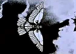
 This is a still from Jan Lenica's animation, 'Labyrinth' and a link to watch the video. I find his work completely captivating. The way he uses collage, drawing and moving image to build up utterly surreal worlds and characters is so skilful that this work transcends the label of a cartoon and exists as a piece of fascinating, beautiful and complete artwork in its own right. Animation is such an exciting tool for elevating a drawing and exploring its potential meanings and emotional impact. The soundtrack in this piece adds to and enforces the atmosphere of unease and heightens the feeling of tension, which is particularly apparent when you understand the context in which the film was made. This Kafka-esque, politically charged animation was made in the wake of De-Stalinisation in Poland, with artists finding a new freedom of expression which had been denied to them by Communist censorship, and with an influx of state-sponsored art under the new government, people could now discuss experiences of hardship and oppression. And I suppose through collage and drawing as opposed to a live action film, the artist is free to be imaginative and expressive with use of metaphor, without the constraints of contemporary technologies. I think that films like this have far more charm, aesthetic value and feeling of authorship than modern cartoons made using CGI.
 http://www.youtube.com/watch?v=Zdq38KPMCvY

Monday 12 March 2012

Storytellers and propagandists


I tend to consider illustration as one of the essential purposes of drawing. Whether it is for children’s books or propaganda posters. Illustrations work on their own. The images might be re-enforced or clarified through text, but the drawings tend to be the centre of focus.

I have a strong passion for “storytellers without language” -illustrators who use little or no text, or whose work does its purpose before you have even started reading the text.

Both children’s book illustration and propaganda art have certain things in common. Such as a lack of realism with exaggerations and modifications from how we see things in real life. Illustration is not necessarily fine art created from references and life studies, it is often drawn from memory, to create ideas and associations rather than to illustrate an exact truth. Essentially, in the way Nigel Homes describes diagram making in Information Without Language.


Shaun Tan’s painting “They came by water” from his book The Rabbits is a prime example of how picture books and propaganda can have very much in common. The book is an allegorical fable on colonisation, though it is considered a children’s book, it might be more appropriate for adults. The absurd shapes, colours and the atmosphere makes a distinct allusion to propaganda posters portraying “the enemy”.

Thursday 8 March 2012

Storytellers and propagandists

Kallithea Camp Athens (18 November 1959).   

 The distinctive ‘shaky’ line of this drawing is instantly recognisable as that of the late illustrator and artist reporter Ronald Searle.  During his career Searle had the opportunity to travel all over the world, using drawing to report on global issues, often from an alternative perspective.  His intention was to get behind the exaggerations of tabloid newspapers and expose the reality of the situation.  Searle’s observation is exquisite and I find his sketches truly beguiling in their impeccable depiction of human existence.  Searle often employed humour in his work, but was entirely capable of changing his drawing style to suit the seriousness of the subject.  With a knack for capturing things precisely as they were, Searle’s sketches could successfully influence the viewer’s view of a situation, alerting them to something they may not have been previously aware off.  This particular image was sketched in 1959, as part of a series of illustrations highlighting the plight of the world’s refugees.  Perhaps what he had to endure as a PoW during World War II allowed Ronald Searle a deeper insight into the sufferings experienced by these people: 

“I tried, in that case, to explain the person in front of me without any sort of trickery or exaggeration.  Tried to get behind the sadness or the hopelessness of most of these camps – everyone abandoned.”[1] 

I would say that Searle has definitely achieved what he set out to convey – the desperation and misery of the situation is palpable in this hopeless image.  The row of ramshackle lean-tos extends precariously into the distance, perhaps for miles, emphasising the magnitude of the hardships faced by the refugees. The eye is drawn to the lonely figure hunched over decrepitly in the foreground.  One is hit by the severity and inhumanity of it all, and this is where Ronald Searle’s talent as a ‘storyteller’ lies – his illustrations present to us true stories with a candour and perceptivity that surely cannot fail to persuade the viewer to come to some sort of conclusion.  No doubt likely to be one of agreement with the opinions expressed by the artist himself.


[1] Robert Searle, taken from Derek Brazell and Jo Daries, Making Great Illustration, p81

Wednesday 29 February 2012

manifesto: persuasion and argumentation in drawing


here is one of the most straightforwardly persuasive draughtsmen I know, Daumier's anti-war blast 'The council of war' 1872. In fact, sorry to stay on the war theme, here is another equally forceful statement in a very different mode, the graphic description of Napoleon's losses during the Russian campaign of 1812, plotted against terrain, time, and temprature. The big fat arrow going right is the army marching east to Moscow, the dwindling arrow pointing left is the ghastly defeated and starving army trying to get back home in the winter. This is one of the first uses of graphic display, and showcased in Edward Tufte's book on Visual Communications. Evidently,Minard is one of Tufte's heroes, with reason. Look at Tufte's book if you want a glimpse at the poetry of railway timetabling!

Tuesday 21 February 2012

Other artists work: What is his manifesto/manifested in the drawing? - C.B. Stapleton

C.Y. Twombly-
It’s difficult to make a calibrated and semi-nuanced case in favor of a prominent artist who’s just died. Opinions at tend to fall emphatically either in the direction of praise (Twombly was one of the greatest American artists of the post-World-War-II era) or bah-humbug (Twombly was a late-to-the-game Abstract Expressionist who tarted up comparatively vacuous paintings with references advertising his erudition). For me, the two extremes are both true, but in a way that leaves my estimation of Twombly not in the middle, but way over on the positive side. Though his works seem to resemble doodling, involuntary drawing or a child
practising writing, he introduces painting in the style of ancient graffiti,
scribbled texts, drawings and simple hand exercises.

Cy Twombly stretched Abstract Expressionism to its limit. He filled his work with a whole lot of white, punctuated by what most critics affectionately call “scribbles,” words printed or written as if by a palsied hand, and clots of nervous brushstrokes that looked like chrysthanemums.
Fifty Days at Iliam: Shield of Achilles, 1978 by Cy Twombly

There’s still something faintly galling about Twombly’s words on canvas, and I probably don’t believe that he misspelled “Ilium” as “Iliam” in the Fifty Days at Iliam permanent gallery at the Philadelphia Museum of Art on purpose because he wanted an “a” to refer to Achilles. Do we really need the words? Do they really add anything, visually, to the work? Do they really evoke anything about their putative subject, beyond simple labeling?
Many people scratch their heads at abstract art and doubt the skills of abstract artists in general, not to mention when the art looks like scribbles. According to The New York Times’ ArtsBeats blog, “…even critics questioned constantly whether Twombly’s work deserved a place at the forefront of 20th-century abstraction, though he lived long enough to see it arrive there.”

Monday 20 February 2012

Sorry for the poor quality! I did this drawing within the past 6 months. This time has been a big learning curve for me within the realms of drawn work. I have always drawn, but never thought I could use it to make strong final pieces, it's always a by product of the creative processes I go through. Over the summer and the past terms I've been working more on my drawing skills, trying to practise frequently, and learning to enjoy it. I did this particular drawing in a life class last term. Firstly I loved the model, I thought she had great character and I'd never drawn a female figure from life before. I am also a big fan of blind drawing techniques and often some of my personal bests/favourites are created this way. I think the quality of line you achieve from loosening up is fantastic and adds a certain charm I can't always get from a focussed sketch. This image is also successful to me as it marks a big turning point in the way I thought about my own image making - starting to believe that I could use drawing in a freer sense, not worrying about how polished or perfected it looks.

Aurore De La Morinerie is fanshion illustrator who captures mood, movement, texture, detail and form. Morinerie achieves all this in a very minimalistic style with quick marking making which can appear to be ink stains at the first glance and often using one colour, watercolour, on coloured paper and letting the negative space make up as much of the image as the marks he lays down.


As I stated in my first blog post it is the marks and the lack of marks that pull me into a drawing. I feel Morinerie's work encapsulates almost everything that I look for and try to create myself in drawings(at this time anyway).