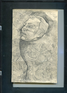
 we were meant to put up a recent picture, and i suppose you could argue i did this 4 years ago, so its not that recent. But, i have a crazy amount of drawings from the day i was born. I my mum is a painter and she made me draw from day one, and shes kept ALOT of evidence. haha. I will post i really recent drawing too, and compare it to this one. This is a drawing of my dads head. I remember doing so clearly in his smokey, dark red living room while he was watching a 1980s film with jean wilder, one of his favourite actors. My dad had an accident, and was spending a a lot of time on is old battered red velvet couch, so i crew him as a couch potato - hence its just his head. This was a time when i was trying to understand my dad better, and not argue with him as much - we managed to get on well when he would talk about his work, or he showed me his carvings. The hundreds of multiple lines are a imitation of how my dad carves into purbec hard white stone, and since i was little had a very strong love of watching my dad whittle away at stone, leaving the raw groves from a specific pronged chisel he ha shaped himself. I really had to look hard into every wrinkle hair and scar - to satisfy this angry want to understand or be on a level with my dad. He is so physically connected to his work, and he is pretty miserable when hes not carving. So, yep, I'm carving his face on the pace in the style he works in, pretty simple. I also I'm pretty miserable when I'm not making, an this for me is one of the most important drawings Ive ever done for that reason - its up in my room, a place i see it everyday to encourage me to work to keep sane and happy, even if its a little doodle of my neighbours cat.
 Tuesday, 31 January 2012
dad
 we were meant to put up a recent picture, and i suppose you could argue i did this 4 years ago, so its not that recent. But, i have a crazy amount of drawings from the day i was born. I my mum is a painter and she made me draw from day one, and shes kept ALOT of evidence. haha. I will post i really recent drawing too, and compare it to this one. This is a drawing of my dads head. I remember doing so clearly in his smokey, dark red living room while he was watching a 1980s film with jean wilder, one of his favourite actors. My dad had an accident, and was spending a a lot of time on is old battered red velvet couch, so i crew him as a couch potato - hence its just his head. This was a time when i was trying to understand my dad better, and not argue with him as much - we managed to get on well when he would talk about his work, or he showed me his carvings. The hundreds of multiple lines are a imitation of how my dad carves into purbec hard white stone, and since i was little had a very strong love of watching my dad whittle away at stone, leaving the raw groves from a specific pronged chisel he ha shaped himself. I really had to look hard into every wrinkle hair and scar - to satisfy this angry want to understand or be on a level with my dad. He is so physically connected to his work, and he is pretty miserable when hes not carving. So, yep, I'm carving his face on the pace in the style he works in, pretty simple. I also I'm pretty miserable when I'm not making, an this for me is one of the most important drawings Ive ever done for that reason - its up in my room, a place i see it everyday to encourage me to work to keep sane and happy, even if its a little doodle of my neighbours cat.
 Monday, 30 January 2012
Architecture "Narrative Sketch"
My narative was about an elderly man who revisited govan with his grandson. On arival he was shocked with how much govan has changed from his childhood. The fast moving flow of workers to and from the ship yards has vanished and all wich was left is memory trapped in his mind.
From that narrative we were asked to create a collage which explores our narrative. The drawing i uploaded is a quick ink pen drawing on tracing paper. I though this was successfull as the traceing paper allowed me to work rather fast overlaying the different levels of the narrative.
The narrator Angus isremeniscing about the days when shipbuilding dominated Govan.
We are getting pulled into his memory, layer by layer, while his memory beginsto evolve around us. Before we know it we start to bepart of the large crowd which disperses into the ever ending memory.
and as we look closer at this memory we realise that we are now indeed looking back at angus (faded in the background, with all the layers of memories bewteen us(the memory) and angus...who now is reality)
Although this was only a quick sketch before actually creating the collage , I was able to explore diferent concepts such as movement layering and looking back.
Duing the whole project i kept looking back at this skecth in order not to distance myself too far from my initial concepts.
Successful drawing
Sunday, 29 January 2012
A successful drawing...
Thursday, 26 January 2012
Successful drawing

Tuesday, 24 January 2012
X-ray of ribs
 This drawing is a charcoal study of an x-ray of the ribs. With quick forceful marks making up the bulk of the drawing I think it gives a clear representation of ribs/lungs as well as the holographic quality from the x-ray. I like that the drawing has a rough appearance but at the same time the viewer(I hope) can easily make out what it is and captures a 3D quality to it. Although this drawing may not be my best, it's important to me as it was where I began to notice that I'm more interested in the marks that make up the drawing rather than the overall finished structure or subject. It was also the start of me making quick rough marks on the page and then drawing in the more precise lines to hold/pull the drawing together, rather than doing the linear work first and then adding detailed texture.
I am interested in how very rushed marks and a few considered lines can build up a clear image. For instance in the top right hand corner of the drawing I left clean lines to show the collar bone and beginnings of the shoulder as well as including more definite bold black lines to show the ribs, without these context might have been lost.
I believe there is a connection between my drawings and my jewellery, as I'm also interested in the textural quality of the metals and rarely create "busy" looking pieces.
24/1/12
I do not draw a lot. Yet I doodle constantly, I find it to be a good way to keep myself concentrating in lectures and a good way to brainstorm during projects. I consider the drawing and doodling completely different actions. While my “drawings” are tight and rigid things that I cannot find it in me to appreciate, my doodles are looser and can be more interesting; or so I find. I challenged myself last term with help from my tutor and Betty Edwards’ “Drawing on the Right Side of the Brain” to integrate the two things into one activity that I might enjoy, I’m still very much working on it. I barely use drawing in my own personal practice, and although this is not an issue most of the time, it does make me feel restricted when working with certain projects. (Which is why I chose Marking the Page as my elective. It is very much outside my comfort zone.)
I chose my drawing/doodle not because it is particularly successful as an image, but more because it shows how I can slip from lengthy doodling (on the right) to a quick observational doodle (on the left) in the style I do hope to improve and develop into something I might appreciate some day.
A Successful Drawing
this image comes from a day in the studio where we used traditional life drawing techniques to draw through a slideshow of both uppercase and lowercase letters of the entire alphabet, in a range of different fonts.
i was absolutely convinced that this was going to be a horrible class, especially for me. i knew next to nothing about fonts or designing typefaces before i got to glasgow and i still feel like i'm lagging behind many of my classmates when it comes to this subject. i also feel a lot of pressure to know what i'm talking about when it comes to fonts and i wasn't the only one who got grilled by our tutor last year for using the wrong font!
however, once we'd got started, i was amazed at how much i enjoyed this exercise. the relaxed atmoshere loosened me up and i was increasingly reassured by the number of fonts i recognised, or had at least heard of, just from some basic research and general reading. (if anybody's interested a really good book about fonts is 'just my type: a book about fonts' by simon garfield)
this exercise, and the knowledge that i wasn't completely in the dark about fonts, made me a little more confident in the studio, especially when it comes to thinking about designing our own fonts, but also about drawing in general.
Successful Drawing. 24/01/2012
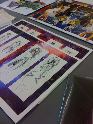
Studying Fashion Design my approach to drawing has changed progressively, definitely more so since doing A-Level Art and Design where my work had a more fine art approach to it. At that point I was drawing to create a beautiful composition and to show skill- now my drawing has become heavily to do with 'articulating my concept'. In a way, I would think, that my drawing now serves more of a purpose, it has become more functional now and is vital in my design process. The manner in which I draw always seems to have an outcome in mind, the lines I am placing on a page often represent something other than a line, they now become a shoulder, sleeve or pleat. There are still classical drawing elements within the course, and it is briefs that incorporate all of the 'aspects' of drawing that I enjoy the most. Drawing architecture, installations and organic forms in a photographic and clear quality have all been integral to various briefs, but the drawing that means the most to me now is the illustration and sketching I do to project my design across to the viewer.
Respectively for the drawing I feel has been the most successful, I picked the line up for my last capsule collection. Achieved through a combination of graphite, pencil and collage- this drawing reflects this feeling I was talking about earlier, that the lines are serving more of a function depicting the silhouette, shapes and draping within each design. Collage is something I have progressively started to merge into my drawing, I like the combination and often in terms of time its quicker to depict something I know could be drawn but is readily available to illustrate the same point. Also in terms of the muses face, I wouldn't want to spend time articulating her features, its what what she's wearing that is important to both me and the viewer I am presenting it too. The element of the drawing I love the most is the fur trims around the hoods of the two garments, rather the abstract and quickened pace in which they were drawn, but they seem to be the most successful aspect, to me anyway.
My most successful drawing...
What is drawing for?
Tuesday, 17 January 2012
Week 2 24 January call for postings

Week 2 24th January instead I'm asking for self-directed research and comments in a BLOG posting: This week’s question is about your own personal practice –what is drawing FOR? Which is your most successful drawing at moment –and why? Your assessment of what you are aiming for in your drawing and the features you think are successful will vary according to which studio discipline you follow. Please include some self-reflection about this aspect of your work as well, especially as the blog format allows you to compare, contrast and comment on other ideas and posts. Post at least one image and 100-300 words of reflection, analysis and context, please. with best wishes from Frances
Friday, 13 January 2012
GSA Term 2 Course 2012
